Asking for action is one of the 5 fundamental elements of every successful ad, opt-in form, landing page, or sales copy.
Your call-to-action is an important part of any sort of copy you have created that induces people to act. An effective CTA tells your audience what to do next and makes it easy to understand what they can expect from performing that action.
Having an effective CTA can make the difference between an ad or sales copy being wildly successful and having a high conversion rate, or it being a complete dud.
Here are 6 tips for writing effective CTA’s.
1. Make it action orientated
Your call to action is exactly that – it’s a call for your audience to take some sort of action.
Some examples of actions include:
- Downloading a checklist or document
- Signing up for an email list
- Making a purchase
- Subscribing to a social media page
Regardless of what the desired action is, your CTA will be more effective when you include action-orientated words or verbs.
This example from Netflix is a great example of an action-orientated call to action.

Instead of the typical “Sign Up Now”, they have made their CTA super relevant and specific to their service. “Watch Free for 30 days” is a much more fun and exciting invitation for users to try their service.
2. Make your CTA’s clear and specific
In order to be effective your call to action must be clear and specific.
You are asking your audience to take some sort of action – so you must be crystal clear about exactly what action you are asking them to perform. This sounds like common sense, but you will be surprised at how many marketers create obscure and unspecific calls to action that leave their audience confused.
When your audience is confused or unsure about what they are being asked to do, you increase the likelihood that they will do nothing – and you will have lost the opportunity to engage further with that person.
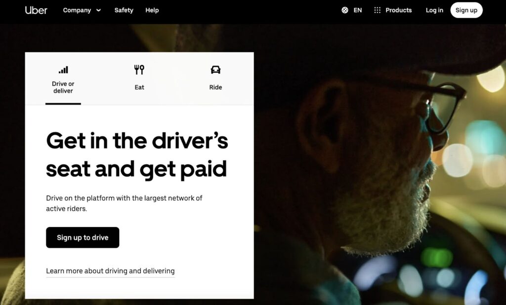
This CTA from Uber makes it crystal clear what they are asking people to do.
3. Make it personal
Make your CTA’s more personal by using pronouns like “Me” and “I”.
Using the first-person perspective will appeal more to your audience as it makes your CTA more personal to them. Writing your call to action from their perspective makes it less of a command or order, and re-frames it as more of an internal thought of their own.
This is so simple to do, yet it is very powerful and effective at changing your audience’s frame of mind or perspective of your offer or CTA.
Check out the example below from CrazyEgg. Using the words “Show me MY heatmap” has the effect of giving the reader ownership of the heatmap already – all they have to do is click to view it.

4. Your CTA should stand out from the surrounding content
In order to draw attention you have to make your CTA stand out from any surrounding content.
The easiest way to do this with CTA buttons is to use colors that make it really stand out. CTA buttons that are bright and bold in color seem to perform better than those that use dark or dull colors. That’s why the majority of CTA buttons are almost always in bright colors like green, red, blue, or yellow. Color psychology is an important part of creating effective ads or CTA’s and you can read more about color psychology here.
As a general rule of thumb, your CTA button should be a color that contrasts well and stands out against the background color. Check out this example from Feedly which uses a bright green CTA button to make it stand out against the white background.

5. Test your CTA’s
ABT – always be testing! When you create a CTA you should always test it against at least one other variation.
There’s no way of knowing what will work best unless you test out different ideas. Take the guesswork out of it, create some split tests, and let the data tell you what works better. When you have a winning CTA then create another test and see if you can improve on the results. Make sure you only test one variable at a time in order for it to be a reliable and accurate test.
You can test and experiment with changing various elements such as:
- Color of your CTA button
- Color of your CTA text
- The words you use in your CTA – verbs, pronouns, etc.
- Fonts
- The placement on your website – top of the page, bottom, middle, etc.
- CTA Button size and shape
Conclusion
Your call-to-action is an important element of any ad, sales page, opt-in form, offer, or landing page.
Having effective CTA’s are essential to getting people to act on your request.
You have to test and experiment with creating different CTA’s that suit the tone, voice, and style of your brand, and which appeal to your target audience. Even if your ad copy stays the same, just by making a few tweaks to your CTA you can significantly increase your conversion rates and improve the overall performance of your ad.
You should always be testing different CTA’s to ensure that you are not missing out on conversions. Even when you have a CTA that is performing well, run a few A:B split tests and see if you can improve upon it. When testing always remember to test one element at a time in order to ensure the validity and accuracy of the test.


