Colors have meanings behind them and can communicate certain qualities or attributes. They can trigger emotions and influence our perceptions and feelings. When it comes to your branding and marketing it is important to understand the psychology of colour and what these colours say about you, your brand, or your product.
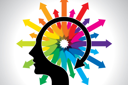
What is color psychology?
Color psychology is the study of how color affects human perception and behaviour. It seeks to understand the effects of color on our feelings, emotions and thought processes.
Do certain colors make us feel better or worse? Can a certain color influence us and make us act in a particular way? These are the sort of questions that psychologists have been asking and researching.
Color psychology in marketing and branding
By understanding how different colors can affect our moods and perceptions, we can use these insights in our branding and marketing campaigns.
Color psychology in marketing and branding seeks to understand how color affects consumers’ perceptions and buying decisions. Different colors can influence your prospects’ impression of your brand or product and can influence and persuade them to take action on your offers.
As visual creatures, humans are influenced on an unconscious level by different colors in various ways. If you can understand the effects of a particular color you can make better decisions when it comes to your logo design, branding, and even the color of your call-to-action buttons and text.
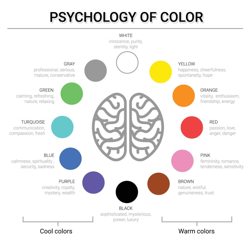
Check out the fantastic color psychology chart from Space Refinery which gives an overview of the different attributes and associations of each color.
Colors and emotions
Colors can trigger various emotions, feelings, and moods. The emotion that gets triggered by color will depend on what we associate with that particular color.
Each color has both positive and negative emotions associated with it. But where do these associations come from? What we associate with each color is normally dependent on three things.
These are:
1. Experience
People have different experiences with different colors, and those experiences can influence our perception of color and the meanings we associate with it. Over time our perceptions and associations of different colors may completely change, or they may become weaker or stronger. It all depends on whether or not we have new experiences which override our old associations.
Someone who works in a funeral parlour will have a strong association of the color black with mourning, sadness, and death. An individual who works on a ship will have a strong association between the color blue and the ocean.
Because we all have different experiences, the things we associate with each color will also differ. There will also be some similarities of course, but it’s important not to make assumptions.
2. Culture
What we associate with a particular color will also be widely influenced by our culture. There are cultural associations with color which differ from one culture to another.
For example: In the West, black is typically worn to funerals as it has a strong association with death and mourning, but in the East, white is typically the color that is worn to funerals and during times of mourning.
In the West, the color red is commonly associated with passion, energy, or danger, whereas in many Eastern countries like Japan red symbolises power and protection.
When it comes to your marketing you have to think about your target audience and what their potential associations are with a particular color. This is especially important if you are expanding aboard or operating in foreign markets.
Taking the time to understand the cultural differences behind the feelings and emotions associated with colors in different parts of the world can help you to tailor your branding appropriately to different segments of your target market.
3. Context
Colors will hold different meanings depending on the context in which they are viewed.
The color green can be associated with money and wealth, or it can also be associated with the environment and being eco-friendly. On the negative side, it can also be associated with jealousy and envy.
The same color will mean different things to different people depending on the context in which it is viewed.
Brand color psychology
Now that you have a good overview of the positive and negative emotions associated with colors, you can use that knowledge to make better and more informed decisions about all aspects of your marketing, branding, and advertising.
There isn’t a one-size-fits-all solution though. What works for you may not work for another company. It all depends on your target audience, the market you’re operating in, and the nature of your products and services. Other factors such as the values of your brand and organisation also come into play.
For example: If you own a very eco-friendly company that is geared towards saving the planet, then green would be an obvious and sensible choice of color to feature in your branding and marketing materials.
On the other hand, green would probably be a poor choice for a funeral director as the color is not associated with mourning and may be deemed inappropriate.
It really is a personal choice as to how your use colors in your advertising and branding, but you should keep in mind some of the more universally accepted emotions associated with colors when designing your logo or creating marketing materials.
The color you use in your branding depends on how you want to position your brand, and what you want your brand to represent and communicate to your target market. Understanding brand color psychology can help you to position your products more appropriately, and can influence how your brand is perceived by your target audience.
How you are perceived by your prospects is important, and this perception can either lead to more sales or fewer sales.
Checklist for selecting your color scheme
Here are some questions to keep in mind when choosing your color scheme for your branding and marketing.
- What are my brand/company values? What color best communicates these values?
- What emotions do I want my customers to feel when they interact with my brand?
- What colors are associated with the emotions that I want my customers to feel?
- What colors are associated with the emotions that I DON’T want my customers to feel?
- Do my brand colors have a completely different association with another segment of my target audience?
- Am I using colors that are positively associated with my niche/target market/product category?
- Does this color show off my brand personality in a positive light?
If you ask yourself these questions when selecting which colors to use in your branding and marketing you will hopefully create a brand that positively appeals to your customers and is associated with the positive emotions you want to elicit in them.